A2 Media Blog


Zoe Hilton's Blog

Search This Blog

Thursday 26 April 2012

Evaluation Question 4

How did you use media technologies in the construction and research, planning and evaluation stages?

Throughout the production of my media texts I’ve used technology to create and demonstrate them. Technology is the most important thing in my project, without it, it would be almost impossible to finish my media texts, gain audience feedback and research. Me and my group we used our own camera to film, as we were more familiar in how to work it, we used a Nikon D5000 Digital SLR camera to film the trailer, it had a 720p high definition video option, it made the trailer look more professional and impressive. The camera’s lenses allowed us to film extreme long shots, wide establishing shots and zoom shots like extreme close up shots. We also used a camera holder, to keep the camera steady when filming; it was a success because it allowed us to film looking down at the screen rather than looking straight into the camera. We used a tripod to hold the camera still and to create panning shots.


Before I started to produce my media texts, I had to research trailers and their codes and conventions and get an idea of what they look like, what they use to create them and how they come about in presenting it. I used ‘Google’ and ‘Youtube’ to research movie trailers and analyse them. ‘Youtube’ was very helpful as it gave me the advantage to search any movie trailer and to search low budget trailers and link them more to ours. We used the trailer of ‘The Blair Witch Project’ to link to our trailer. The comments people leave underneath every video on ‘Youtube’ kind of helped me, as they were talking about the codes and conventions the trailer was using. 


I watched many horror trailers and I picked up many codes and conventions and get an idea of what my trailer would look like. The trailers tend to start slow, to build up the tension and half way through the music starts to get louder and quicker, the transition between every scene starts getting faster, makes the audience to get more into it and more eye catching. When we finished filming our trailer we uploaded it on ‘Youtube’ to get some audience feedback and for people to see what we’ve done and what we have achieved. 
When we started editing our trailer we used this programme called Adobe Premier Pro. This software is a professional editing programme, it allowed us to do many things, the programme was very helpful and it wasn’t that complicated to use. The programme contained free music, like dark and horror sounds. This was very helpful as we used some sounds for the background music and background noise. 
To display the final trailer to the class we used an interactive whiteboard to show it on a big on a big screen. The high definition really stood out and the music was quite loud, making it more interesting to watch. We used the whiteboard to show our presentation to the class as well, so everyone could see what we wanted to achieve by the end of the project.
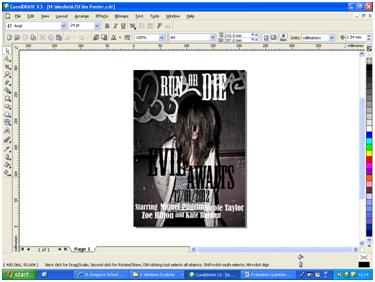
 To create my poster and magazine cover, we had to research some examples first on the internet, I used ‘Google’ to research images of film posters and magazine covers, I researched their codes and conventions as well, to know more about them and have an idea of how my media texts will look like.
The programme I used to create my film poster and magazine cover was ‘CorelDraw X3’, its really easy to use and you get a lot of options of how you want your writing to look, and you can put them anywhere you want.

I used Photoshop to edit the pictures I used for my film poster and magazine cover, I wanted to picture to look darker and more horror looking, I did this by adding some contrast and changing the levels of shadows and reducing the amount brightness present in the picture.
I used this free web programme called ‘Blogger’ to show and illustrate all my work I’ve done throughout the year, it’s really easy to use and you can choose what background you want, what font you want, anything. You can separate your work by labelling them; this is a useful way to find what piece of work you want to see from my blog.


Friday 20 April 2012

Evaluation Question 3

What have you learned from your audience feedback?
Audience feedback is a very important focus for my project, it helped me improve the trailer, my front cover magazine and film poster. I held some audience feedback, at the beginning and at the end of my time of doing my A2 coursework. This helped me make improvements throughout the year, and gave me a chance to make some last minute improvement as well. Film producers do similar things; they do small screenings to a small audience and they take the audience’s comments into account at the end to improve the film trailer and film. To begin with we showed a first screening to our media class, we only showed some scenes we made at the beginning, and we showed how every scene would change to another scene, we added the background music at this point and some sub headings in some scenes. The audience gave us some feedback, in what they liked and what we could’ve improved on.
We made a presentation about our film trailer and showed it to the whole class; we created story boards to have an idea what we wanted to do and to make the story line more original and interesting. After we showed the presentation we asked a couple of people of what they thought about our story line and what they liked and didn’t like about the whole idea of the plot. We took a video of the presentation we did in class, and a video of some people talking about our film trailer. PRESENTATION AND AUDIENCE FEEDBACK VIDEO.
Maria Gonzalez said, ‘I thought your story was very inventive and something that could attract those with horror passions. I think your storyline could be just a bit more unique. You also have to think that there are other films out there which could have a similar storyline’.
Mr Morris said ‘“I think your idea is reasonably good. However, you didn’t offer a lot of detail about the characters. But I like the idea of being out in the woods, getting lost and the idea of people going missing one by one building the tension. A couple of issues; one which Miguel had already guessed and that is one of location. I’m a bit nervous about you actually finding an abandoned house to film in. You are also going to be out in the woods, so be very careful not to just run around with a camera screaming. We have had a lot of cases of people doing just that and it does not look very original. We are a few weeks away from all the leaves falling off the trees, so that might be a problem with continuity. You will either need to film before or after the leaves fall of the trees”.
Maria’s comment made us change the plot slightly different from what we originally planned to do so it becomes more unique and doesn’t look similar to other horror films out there. The feedback we received from our teacher Mr Morris made us think about how much time we had to film and how could’ve we kept the same weather and conditions for the film trailer as the leaves were starting to fall. He made is think about the location as well, luckily we all knew this abandoned place in Pembury and it wasn’t too far away from where we lived so it wasn’t that difficult to get an appropriate location for our trailer. We tried to film the whole trailer in two days to get the same type of weather and conditions, which was cloudy and gloomy which helped us build the horror genre within the trailer.
Before we finished our trailer we did a second screening to the class and people gave us more feedback to make some last minute improvements. This made us think in what we could’ve improved like adding some voice overs and make the last scene of the hands slower for the tension. SECOND SCREENING AND FEEDBACK FROM CLASSMATES.
For my magazine front cover and film poster I asked some of my friends to give me some honest feedback in how I could improve and what do they like about it. I posted my film magazine and poster on my Facebook for a few days and asked if they could comment on it telling me what they think about it and if they think I could improve on it at all. The comments helped me a lot as it gave me new ideas in how I could’ve laid out my texts and what font sizes I could use, etc.
Audience feedback helped me improve my film trailer and my media products, is what the decoder wants to see so you must get some ideas from them and take them into account.

Evaluation Question 2

How effective is the combination of your main product and ancillary texts?

Part of our A2 coursework was to complete a film poster and a magazine front cover for the film trailer we have created. When creating the three media products I had to frequently consider my target audience. The magazine front cover and film poster had to link to the film trailer, with the genre and with the target audience. I used the same person for the film poster and front cover, so the audience gets an idea of whom the main character of the film is and who is the one they have to keep their eyes on.

When creating my magazine I had to think what the audience want to see, they've seen the trailer already, so I will have to use the same codes and conventions as I did with the trailer. For both magazine and film poster I've used the same character, the font and colour I’ve used creates a more horror outcome, the font is very big and the colours I've used were black and white; I did this because I wanted to keep the horror genre and appeal to the teenager audience. The film is targeted to young adults ages 15 – 25, both genders; I tried to make it pleasing for both genders and make it look interesting and eye catching for the young people.

The ancillary texts are supposed to support the trailer, giving film promotion and advertising. The magazine cover is targeted to a young audience just as the film poster and the film trailer, the business will make more money if they target films to a younger audience, and they have a tendency to spend more money on films and magazines than the older generation.

My magazine and film poster look very dark and gloomy, the fonts are only black and white, making it look more dark and scary looking. I didn’t add a lot of texts or pictures because they will only need a few sentences and one main picture, it makes it more unpredictable, making the people buy the magazine and read what’s it got to say about the film and then this makes them watch the film at the cinema.
I edited the pictures to make them look darker and gloomier, I added shadows and more contrast, and I reduced the brightness; I made the character stand out from the picture, it kind of hits you in the face with all the darkness and then the character looking at you.
The film posters would be placed on big billboards, bus stops, shops, newspapers and magazines. The magazine would be sold in big shops like WHSmith and newsagents around the country.
I can honestly say that my ancillary text link very well with the trailer, I have used the same codes and conventions throughout the making of my media products. I used similar themes with the trailer and the ancillary texts. I could’ve improved by planning everything first and then make my media products, get more of a clearer idea at the beginning.
If you want to watch the trailer of 'Evil Awaits', Click Here!

Friday 30 March 2012

Evaluation Question 1

In what ways does your media product use, develop or challenge forms and conventions of real media products?

                  When creating a media product the encoder will need to refer to forms and conventions just so the decoder knows and likes what they are watching. When creating the trailer we stuck to the genre; the genre we chose was horror because we knew more about this genre and horror is one of my favourite film genres. We made sure the trailer stuck to the genre by adding voice overs, captions and scenes, we had to make sure that the trailer was presented in a way that would attract to the audience we are trying to aim at. Our target audience are young adults both genders age 15 – 25. The way we attracted the audience was using young characters, scary dark setting (the abandoned house) and slow pasted background scary music.

The abandoned house sets the horrified scary mood; it’s perfect for our target audience and for the genre. Some parts from the trailer were filmed inside the abandoned house, so the trailer shows dark and scary scenes from the house, some of the parts are filmed outside with one of the characters running, we tried making those parts look gloomy and dark by editing it and changing its lightning and brightness.

The characters shown in the trailer are the main characters from the film off course, we were all involved in playing a part in the film trailer, we used young characters to target the audience, the target audience are young and they are always looking for something exciting, so the best idea was to use young characters and create a more up thrilling trailer using young people, they’re more outgoing and they tend to be looking for trouble or something fun, and that’s why they end up in an abandoned house just because one of them gets curious and starts exploring the inside of the.
The elements we added in when creating the film trailer were carefully selected so we could target the genre and audience properly. We fitted all the conventions in our trailer so the decoder gets what he was expecting to get and encourage him to watch the film.  We set the scene like any horror film, dark, gloomy and in the middle of the woods, where the characters get lost after being chased from the abandoned house.
The opening scene of the trailer is a shot of the three young girls talking about subject of ghosts and saying how they don’t believe in them and then they plan to investigate going to an abandoned house his friend ‘Alex’ knows about. That conversation then leads into the scene of the four teenagers walking to the abandoned house, we used a close up shot to show their feet walking towards the house, creates a tenser mood and the scary music is playing as well. The shots are slow at the beginning and they gradually get faster, creating a more professional look and it links with the horror genre, showing the beginning all calm and tension building up and then by the end it gets faster and that’s when the horror starts.

Friday 2 March 2012

Film Poster Research

I've finished designing my magazine front cover and now I've got to design a film poster for my trailer. I've done some research and have looked at some film posters to see if they can help in how doing them and what elements I will have to add to my film poster.

Film Poster
A  film poster is a piece of printed paper designed to be attached to a wall or in any vertical surface. Typically posters include both textual and graphic elements. Posters are designed to be both eye-catching and informative. They advertise the film and the actors and actresses.
They are usually found around the streets, on billboards, bus stops, underground, buses, etc.

Example of Film Posters


As you can see these are film posters from recent films, they usually include a main picture with the main actor or someone important from the film and then the film title covering the picture at the bottom, they sometimes add a tagline around the film poster usually at the top or underneath the film title. They always add the release date, and some information about the companies involved in the making of the film.
For my film poster I will be adding a main picture of Kate Burden, one of the main characters from the trailer, it'll be dark and scary linking to the genre of horror, I will add the film title at the bottom with the date and naming the actors and actresses involved in the film, a tagline at the top making the poster more eye catching and I will be editing the picture to make it look more scary and more professional looking.